Visual storytelling reimagined in a way people love
I am a User Interface and User Experience Designer based in Phoenix, AZ. I like to understand people before solving their problems, and to craft digital solutions that resonate.
UX Design • UI Design • Wireframing
Prototyping • Front-end • Project Lead
About Me
My name is Shambhavi Sengupta (she/her/hers), or Sam Sengupta as I prefer to be called, and I am a user experience and interface designer. I was born and schooled in Bangalore, India, and I'm currently residing in Phoenix, Arizona. I am passionate about creating a more accessible technical environment which is available for all types of users.I believe that the best way to bridge the gap between the user and technology is through creative and iterative design. I design user experience and interfaces by taking into account the clients’ needs and expressing them through bold and engaging prototypes.I am in the process of completing my M.S. in UX Design at Arizona State University. I have also completed University of California Berkeley's UX/UI Bootcamp, and the UI/UX Design Career Track at Springboard. I currently hold a Bachelor’s degree in Integrated Digital Media from New York University, Tandon School of Engineering. Currently, I am focused on gaining a comprehensive understanding of the role that UX design plays in today's social climate. Alongside this, I am taking various online courses to improve my front-end development skills with JavaScript, HTML/CSS and Python.I enjoy working on sketches, web design and other front-end projects. I also love photography and discussing film in my free time and I have an anonymous Tumblr account to share my views on the same.
More UX Case Studies
Other Design Projects
Bluetooth Speaker Design
MY ROLE
UX Designer (Team Project)
TOOLS USED
SketchUp 3D, Google Docs, Google Sheets, Google Forms, Canva.
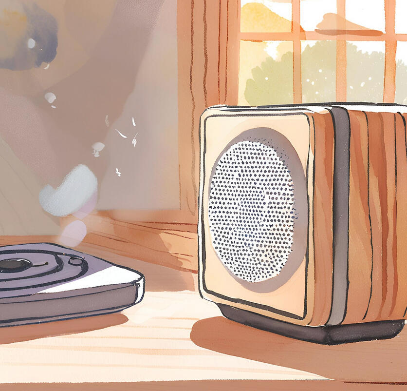
This was a semester-long design project to design a physical device, and my team and I chose Bluetooth speakers for its commonality and both physical and digital functions. We set out to design a speaker that combines user-centered functionality and modern aesthetics. Our goal was to design a speaker that not only meets the needs of music enthusiasts but also stands out in a competitive market by addressing common user pain points, such as portability, battery life, connectivity, and intuitive controls.To guide our process, we adopted a human-centered design approach—beginning with user research to understand the behaviors, preferences, and challenges faced by individuals using their own Bluetooth speakers. Insights from this research informed our design choices, including speaker size, form factor, and features like button placement, battery indicators, and enhanced connectivity.Our final design prioritizes seamless user experience, balancing aesthetics and functionality. Through this case study, we document our journey from initial research and ideation to testing, prototyping, and 3D modelling; while showcasing the tools, methodologies, and design decisions that shaped our solution.
>> Click on the image below to browse the project case study presentation.
Seneca Holdings Redesign
MY ROLE
UX Designer (Individual Project)
TOOLS USED
Figma, Google Docs, Google Sheets, Google Forms, Canva, Figma plug-ins for icons (FontAwesome).
This was a semester-long design project to redesign the website for Seneca Holdings, a company that provides strategic investment, development. The goal was to create a modern, user-friendly digital experience that effectively communicates the company’s mission, services, and values while meeting the needs of its diverse audience (which includes potential investors, clients, and partners).The existing website presented challenges such as outdated visuals, unclear navigation, and a lack of accessibility, which hindered the user experience and failed to reflect Seneca Holdings' forward-thinking approach. To address these issues, I followed a user-centered design process involving thorough research, strategic planning, and iterative prototyping to ensure the redesign aligned with both user expectations and business goals.By incorporating best practices in UX/UI design, improving information architecture, and enhancing visual appeal, my goal was to deliver a site that not only looks polished but also provides an intuitive and seamless browsing experience. This case study outlines this process, from research to design, highlighting the tools, methodologies, and decisions that shaped the final solution.
>> Click on the image below to browse the project case study presentation.
Sofvie
MY ROLE
UX Designer (Team Project)
TOOLS USED
Figma, Google Meet, Google Docs, Google Sheets, UI Kits, Figma plug-ins for icons (FontAwesome).
Getting to Know the Brand
My design internship through Springboard was a 2-month long project with Sofvie, which is a company that builds software solutions for industrial brands in Canada and the U.S. I worked with two other students, and our point of contact was Sofvie's technical manager, Dan.Our project started off with the kick-off meeting, where we got to know a little bit more about Dan, a few things about Sofvie and what they do, and details about the project we were going to be working on. This helped us coin our problem statement and our goal + timeline for the project. After that, we met every week to discuss our progress and get feedback.
Problem Statement
"Refit Canada is a company that does record keeping for refrigerants with a QR tag on industrial coolants. They want a smooth and iterative brand guideline for their current website to promote their product and to explain to their users how it works. They also want a few high-fidelity mockups to give the stakeholders a better understanding of their product. This is a B2B company, and caters to customers who are already in the industrial coolants industry."
Goals
Our goal was to finalize a style guide and a branding guideline that can be used to design Refit’s current website. All of us three designers will be working on creating the style guide and working on high-fidelity mock-ups, submitted as deliverables by the end of each week.We broke down the deliverables into tasks (moodboard, user flows, style guide, mockups and logo) and assigned an approximate time estimate to each aspect depending on how long we thought each step would take.
Moodboard
The first step was the moodboard. Each of us made a mini moodboard based on what we thought the brand most represents, and we came up with a few colors that we thought would suit the current brand. When we met, we combined the aspects we all liked from each of our moodboards and made a final moodboard with the colors, images, UI styles and general theme and layout, as shown below.
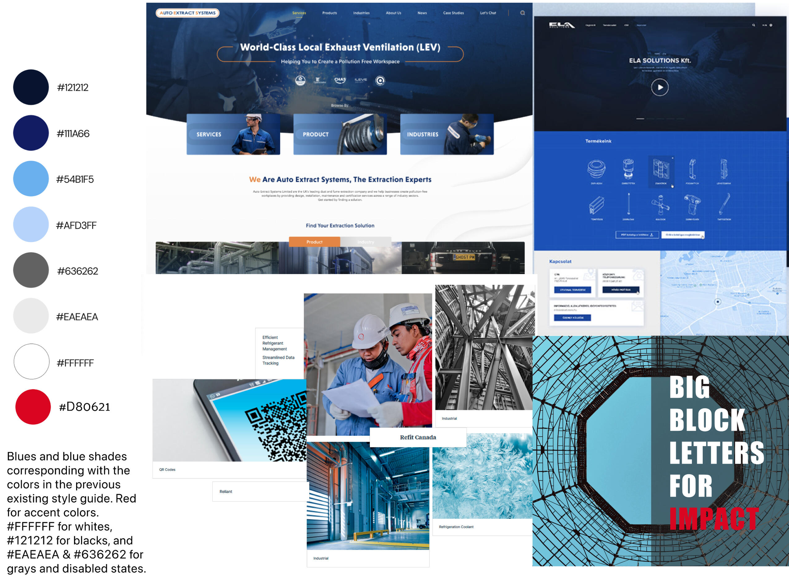
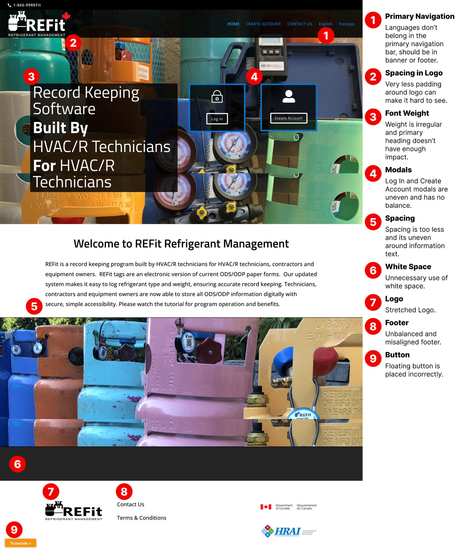
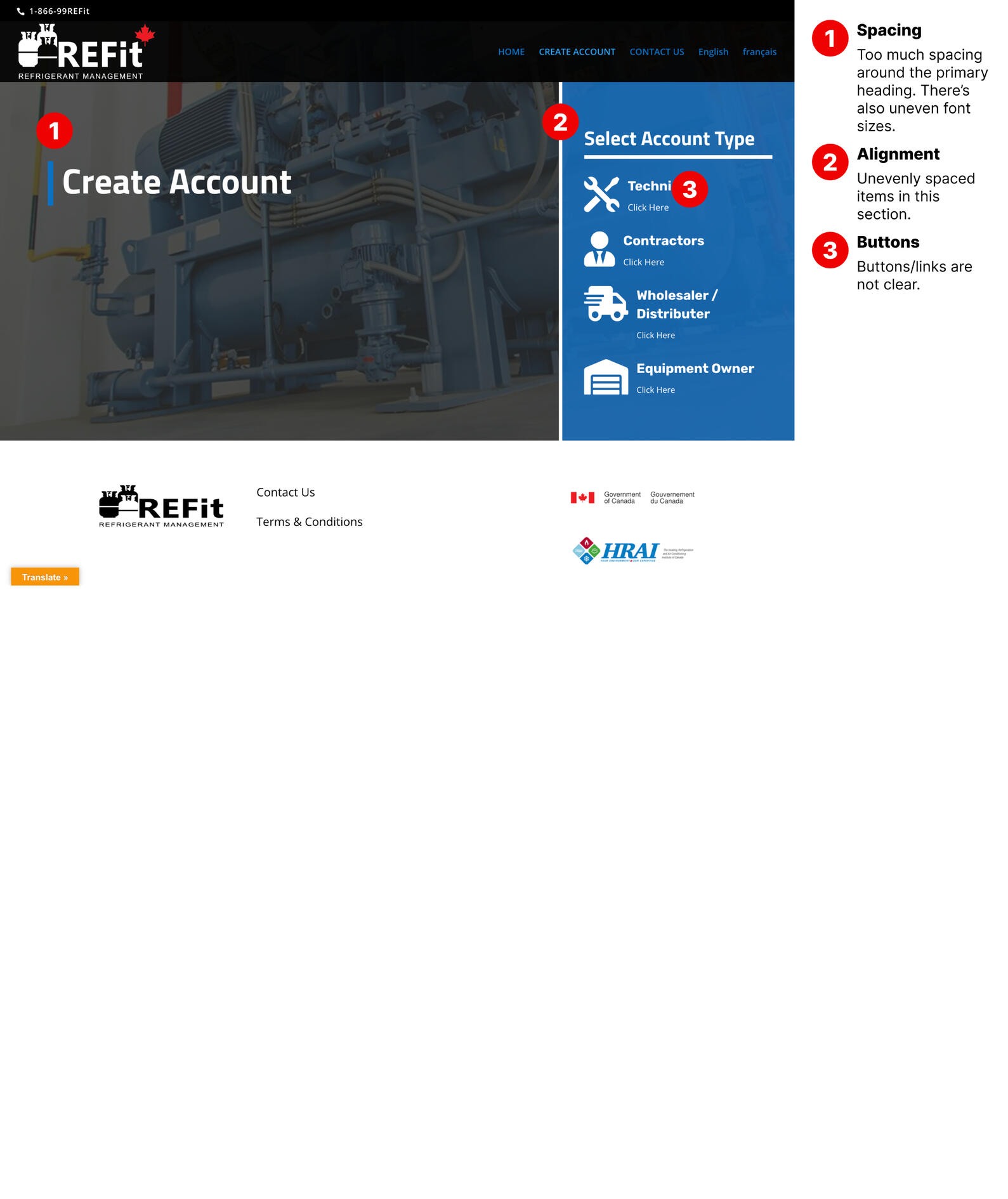
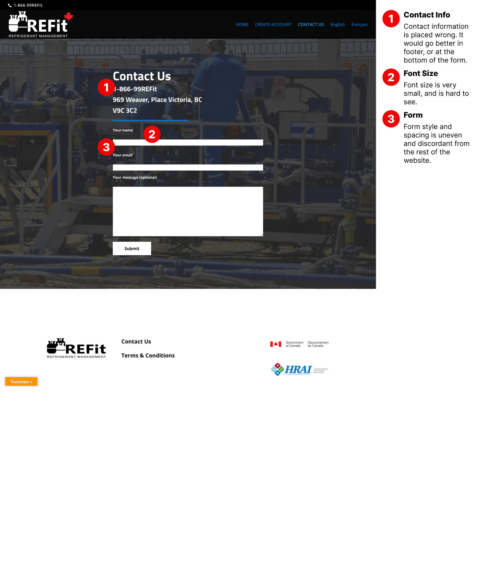
The shades of blues suited the theme of what Refit was selling, and the UI styles were from other industrial websites that are currently on the forefront of the industry. We decided on making a simple and ergonomic website which can be used by both buyers and workers alike.Here's a link to their original website, and you can see the heuristic evaluation for a few of their primary pages below.
style guide
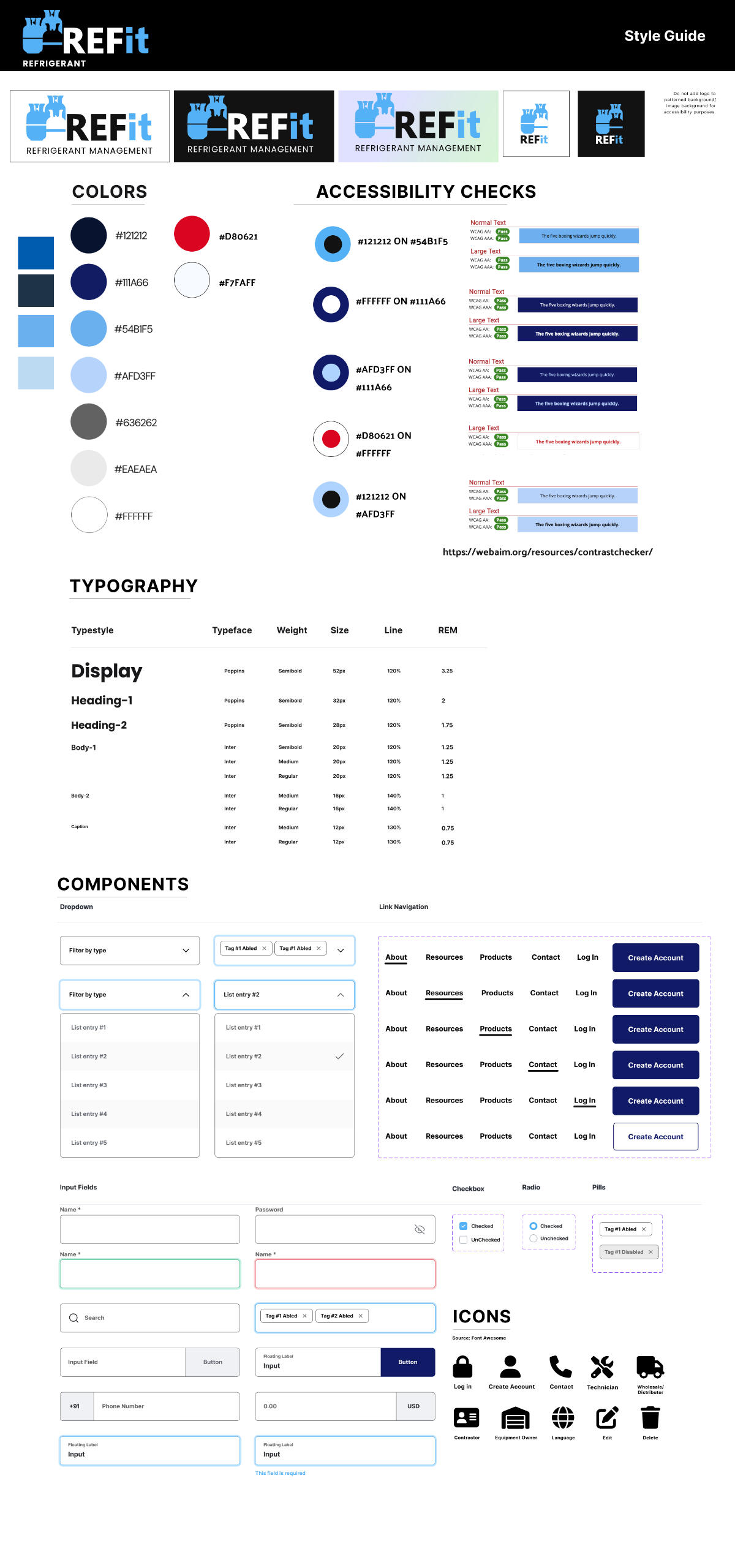
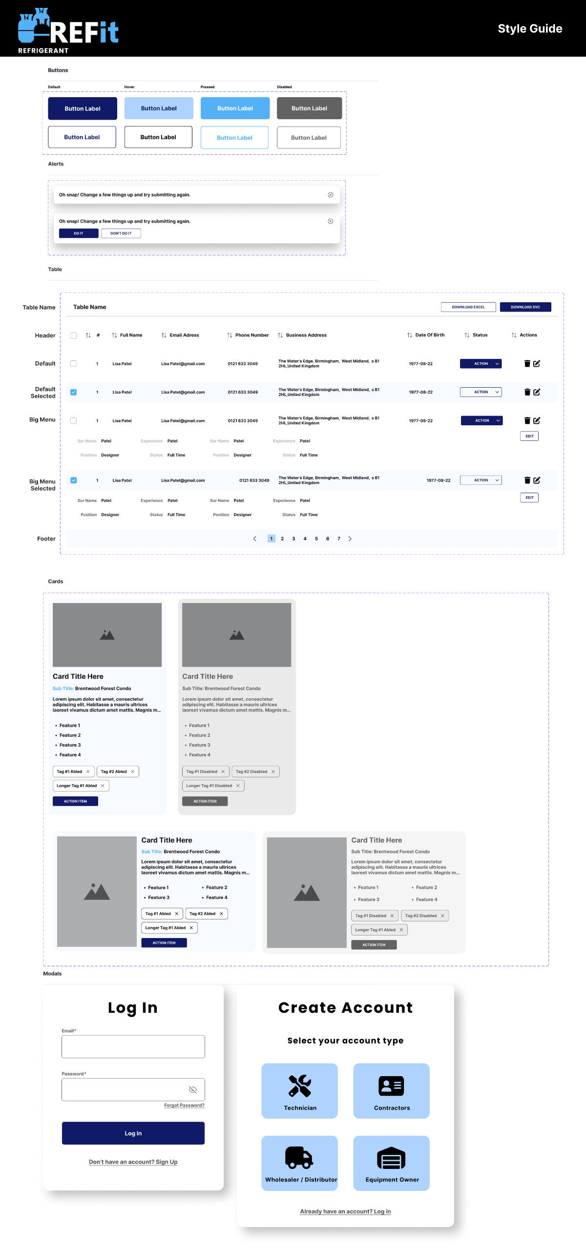
Our final deliverable was a comprehensive and detailed style guide on Figma. We included items that would be necessary in the website, including color palettes, fixed typography, and components like dropdowns, text fields, primary navigation menu, check boxes, radio buttons, pills, various button styles, tables, alerts, cards, modals and icons. We also made most of these components with nested auto-layouts so it would be easily scalable and adjustable. I also included a color accessibility check for the color palette and text for easy reference. We used these components to build our hi-fi mockups. The complete and final style guide is the image below.
stakeholder suggestions
We met with our primary stakeholders, the founders of Refit Canada, to show the style guide and the mockups and they had a few suggestions for our design:∘ Change the logo colors to match their new brand guide
∘ Remove the red accents in the color palette to match the logo
∘ Add a tab for the products in the shop they want to incorporate in the future for technicians and manufacturers
∘ Change the colors on the homepage to make it darker
∘ Make the logo smaller for icons and tab sizesWe incorporated these suggestions into our design and style guide.
hi-fi mockups
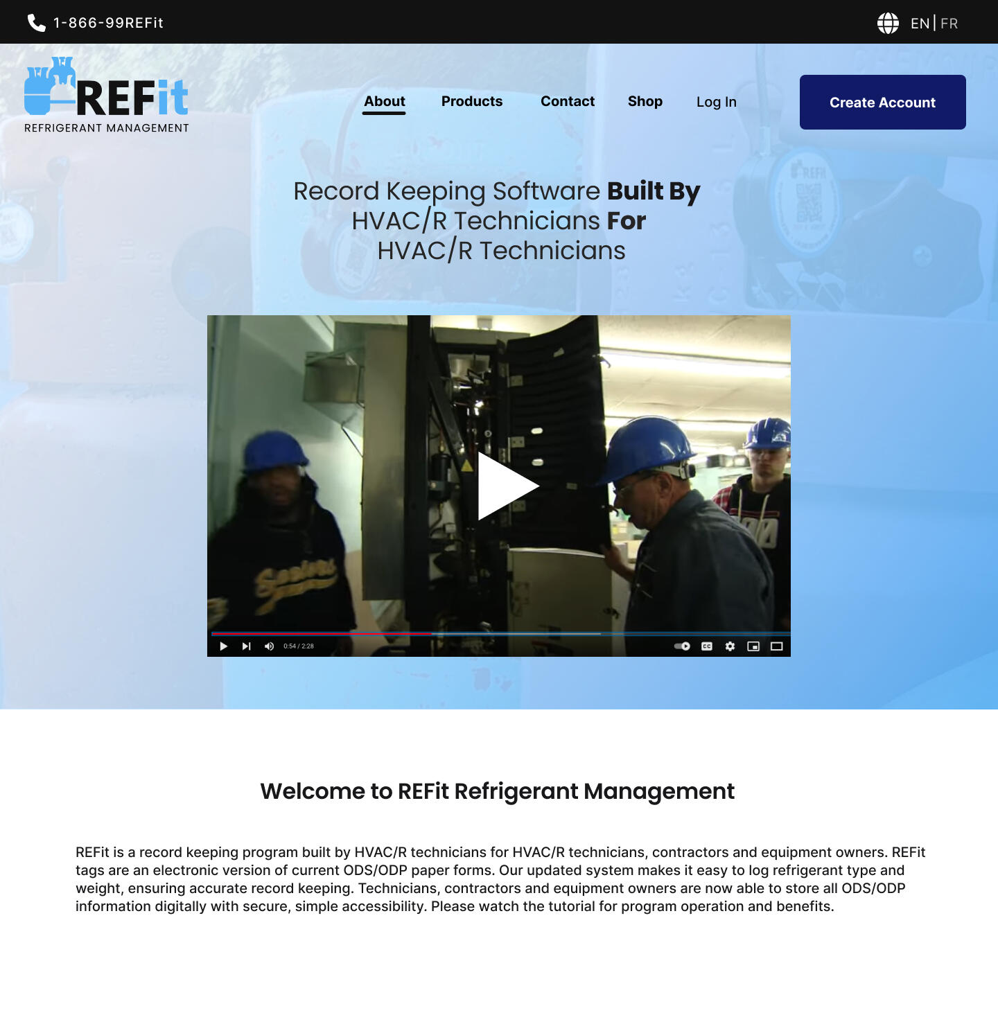
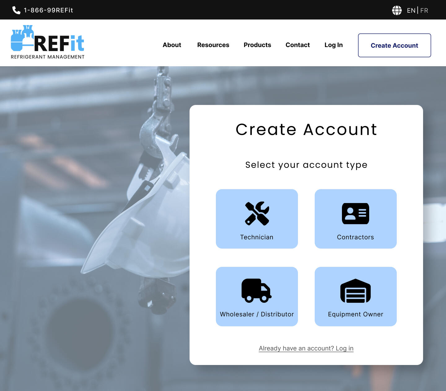
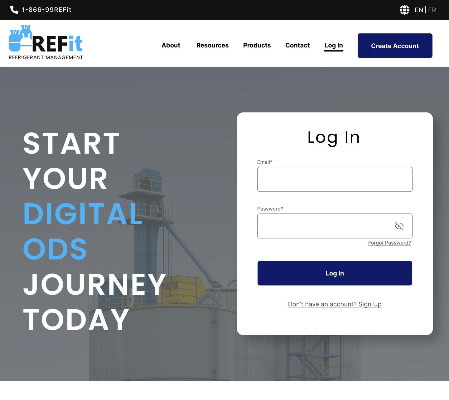
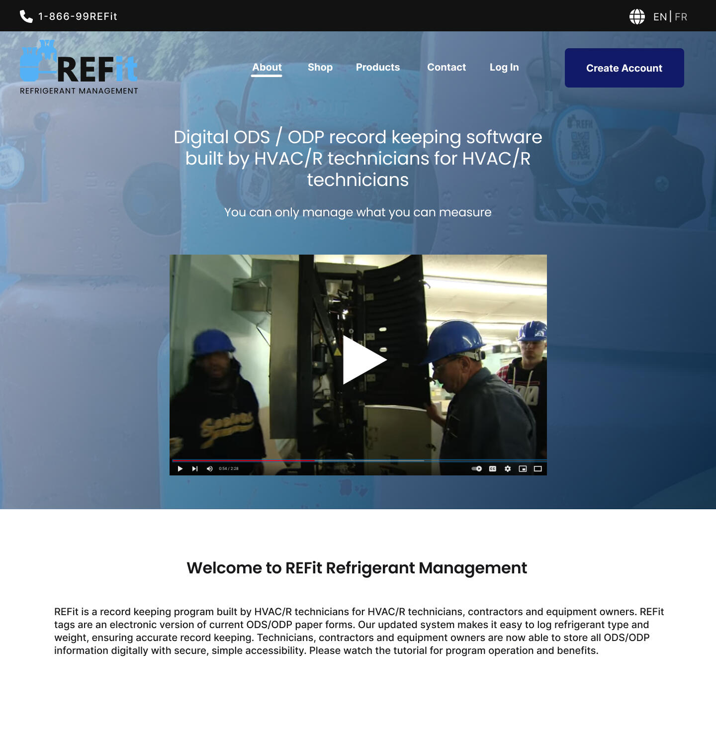
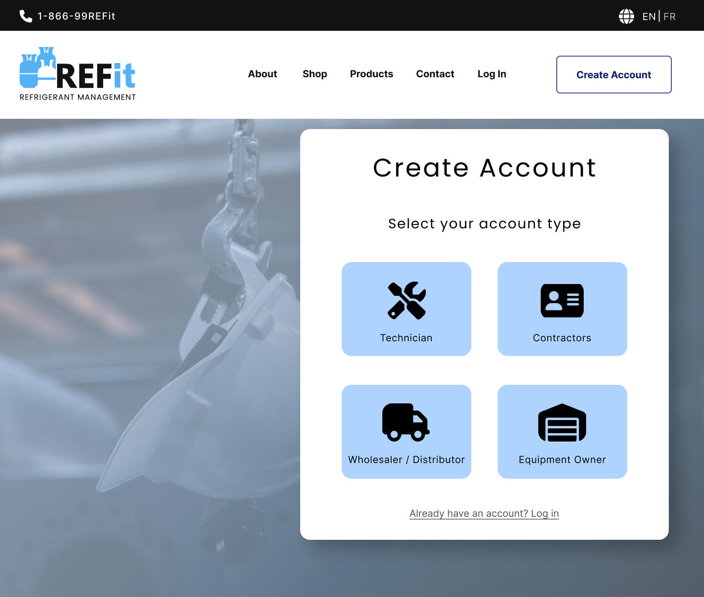
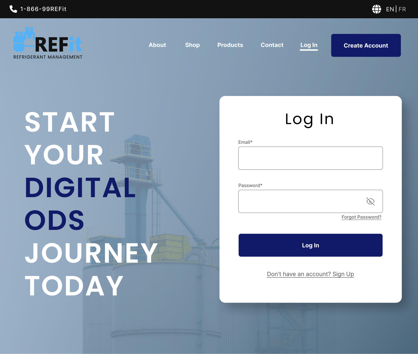
We made a few hi-fi mockups with the components we designed and it looked like this. Version 2 is the final version and used the changes suggested by the stakeholder.
Version 1.
Version 2.
logo design
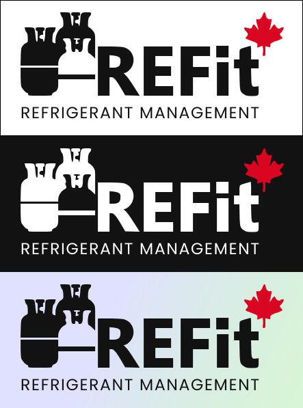
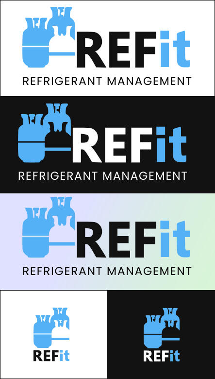
According to the feedback given by our stakeholders, I changed the colors of the logo and removed the red leaf from it. I also added a version to be added for icons that has text that is easily detachable. This was done in white, dark and colored backgrounds.
Version 1.
Version 2.
further features to explore
Once we finished with our deliverables, we handed it over and had a final meeting discussing some further opportunities:1. Design and implement a products page for the products they wanted to implement in their websites. Since they hadn't finalized on the products list, so we couldn't create it yet. However, the card component we designed in the style guides would make this process much quicker.2. Have more meetings with our primary stakeholders and work closely with them to make the products page, and other pages that they want to see in the mockup.3. Incorporate the QR scanning feature of the brand for the different user groups into the website and to start translating the layouts into an app (as mentioned by our stakeholders).
challenges and lessons learned
1. The biggest lesson I learned during this project was the value of teamwork. I have always worked alone on UX projects, but this time I wasn't. Meeting with my team regularly not only reduced my workload, but it also helped me realize that it's always better if there is someone who you can bounce ideas off of. We worked as a group and delivered as a group, and the entire process was much smoother because UX and design is best done as a team.2. Routine meetings with our supervisors and stakeholders served as invaluable platforms for collaboration, knowledge exchange, and problem-solving. These interactions created a space for addressing any ambiguities, seeking clarifications, and sharing ideas and feedback. This open channel of communication played a pivotal role in resolving any doubts or uncertainties we might have had, ensuring a cohesive understanding of the project's goals and requirements.3. Furthermore, it also provided me with a deeper insight into the project by exposing me to their perspectives, expectations, and insights. This not only helped in aligning our design efforts with their vision but also broadened my horizons regarding the project's context, user needs, and business objectives. It was during these interactions that I gained a profound understanding of the broader implications of our UX design decisions, which in turn informed our design choices.
Dome: Fitness Tracker App
MY ROLE
UX Designer (Individual Project)
TOOLS USED
Figma, YouTube, Google Docs, Google Forms, Google Sheets, Springboard Curriculum, UI Kits, Figma plug-ins for icons (Iconly).
Designing a Fitness Tracker
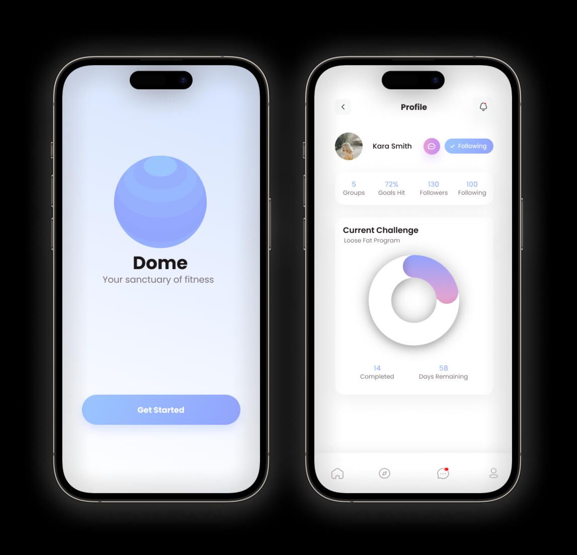
My time at Springboard taught me a lot. One of the most important projects I did with Springboard was my Capstone 2 project. We had to chose from a few real-world problems provided to us and work at a solution for it by using the step-by-step process we had learnt about. I chose to design a fitness tracker product. The simulated scenario that I picked was:
"A well-established company launched a family and friends health tracking app three years ago. It is for both iOS and Android. The app allows users within a group (a family or group of friends) to see how others within the group are doing regarding health and fitness. Currently, there is no messaging feature within the product. The company would like to integrate messaging into the app."I picked this scenario because I was curious what it would be like to work as a UX designer in a real problem with a company. I know that most real-world UX projects are used to focus on one particular function of their product, rather than building the entire thing from scratch, which is why I hope I get to work on more projects like this in the future. In my previous project, the Meal Prep App, I found out that fitness and food tracking go hand in hand, and a few of my user interviews in my previous project mentioned worrying about their health and fitness, which is another reason why I wanted to work on this scenario.
problem statement
On average, user engagement for a particular fitness tracker app is heavy for the first three weeks then it drops off and soon after, the users delete the app. I aim to design a new messaging features that creates sustained engagement.According to my project manager, the goals are to:
1. Create the opportunity for users to message each other about their health and fitness goals/achievements
2. Create an integrated messaging experience throughout the product to encourage engagement and repeated usageThe major question revolves around—how to integrate the messaging feature within the existing features? Is there a general messaging feature allowing users to message each other separate from health and fitness activities? How might we otherwise increase repeat usage and engagement?
Target users and company brand
The target users are:∘ 18 - 34 years old
∘ Very tech-savvy — they are on their phones for several hours a day
∘ Very budget-conscious
∘ Messaging and communicating with friends and family is a very important part of their daily livesThe brand's personality is of a trusted friend with a good sense of humor who always has your best interests in mind. The brand attributes are:∘ Contemporary
∘ Trustworthy
∘ Humorous
∘ MotivationalThis gives me a brief idea of the type of users I have to create a solution for. It also gives me an idea of the kind of design that would be relevant for this app.
research and synthesis
Once I decided on a problem, the first step was to do secondary research on other industry leaders that solve the same or similar problems, and here is what I liked and disliked about three of them:
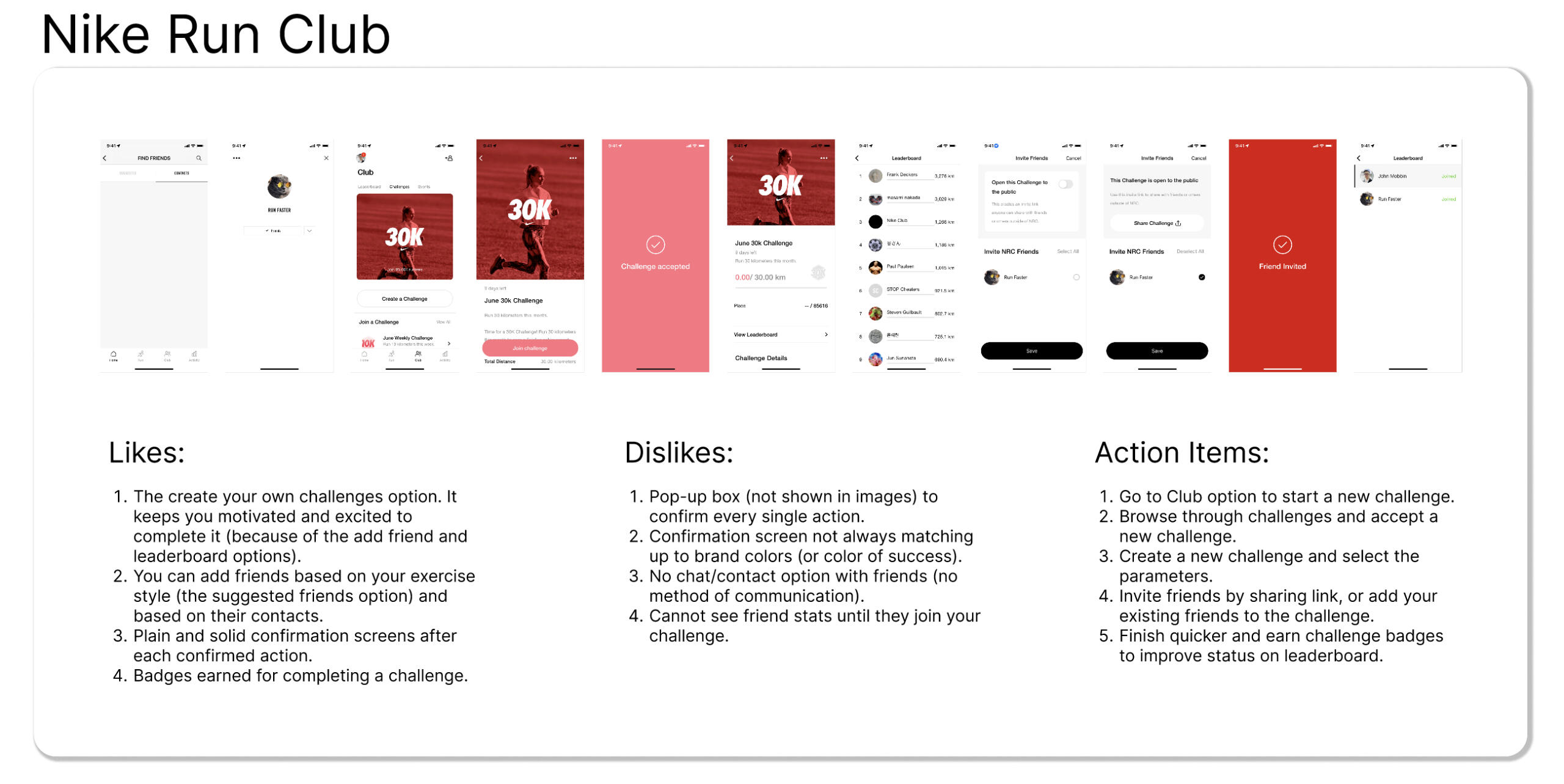
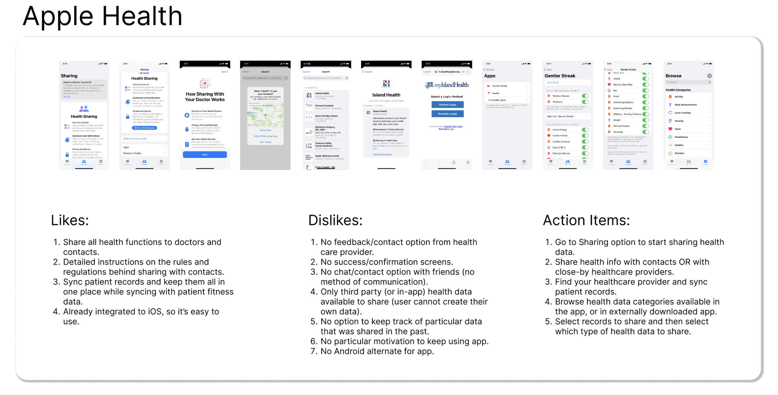
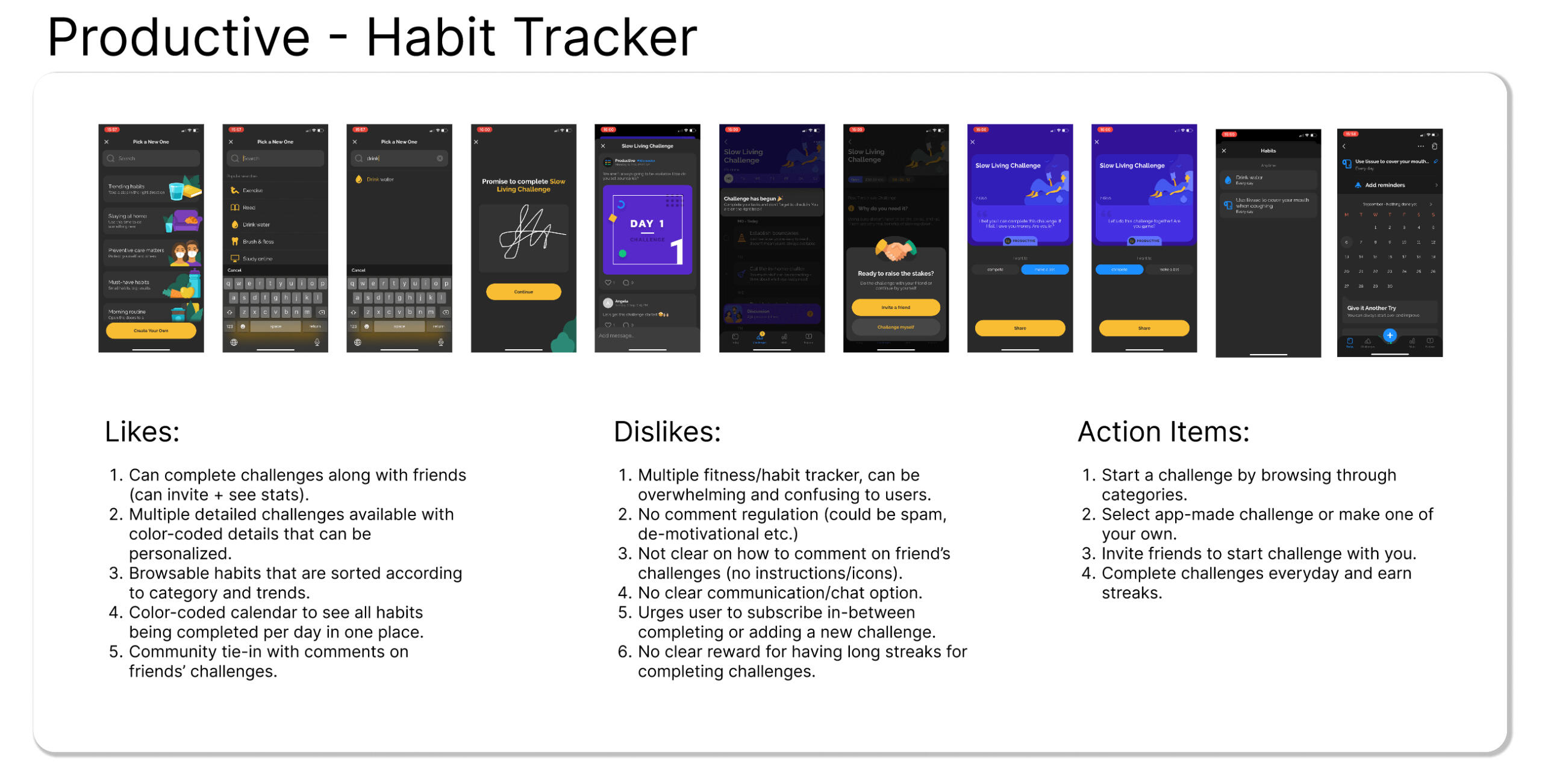
For quantitative research, I sent out a Google Form survey with a few questions about the workout habits of people so I could get an insight into why people use/do not use workout apps. The results are given below.
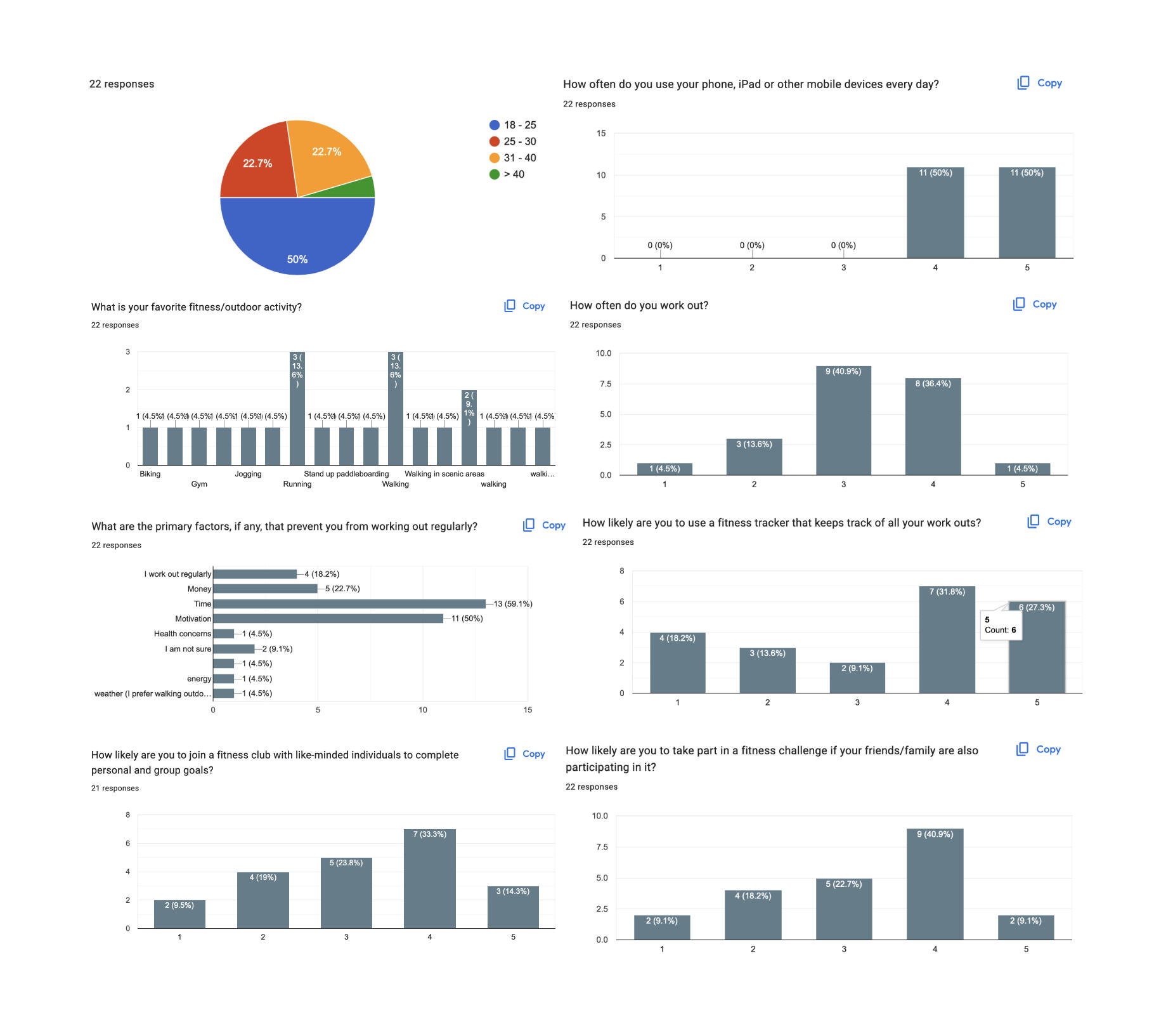
It is important to note that most users:∘ Are in the 18 - 25 years old range
∘ Are very often on their phone
∘ Enjoy running/walking outdoors as a fitness activity
∘ Workout on an average frequency
∘ Cannot workout regularly because of lack of time
∘ Are more likely to use a fitness tracker for their workouts than not
∘ Are more likely to join a fitness club to complete personal goals
∘ Are more likely to take part in a fitness challenge/club if they have friends/family in that group
Which means, the app needs to:∘ Be for Gen-Z/millennial users who are frequently on their phone
∘ Include a lot of walking/running outdoors activities
∘ Work regularly for frequent returning users
∘ Have quick, easy to use functions that aren't cumbersome
∘ Include a fitness tracker
∘ Include the function of fitness clubs
∘ Include quick share/add functions to the fitness clubs
Since I already know my target users and the company brand, I directly moved on to building a brand and components library.
brand identity, typography and iconography
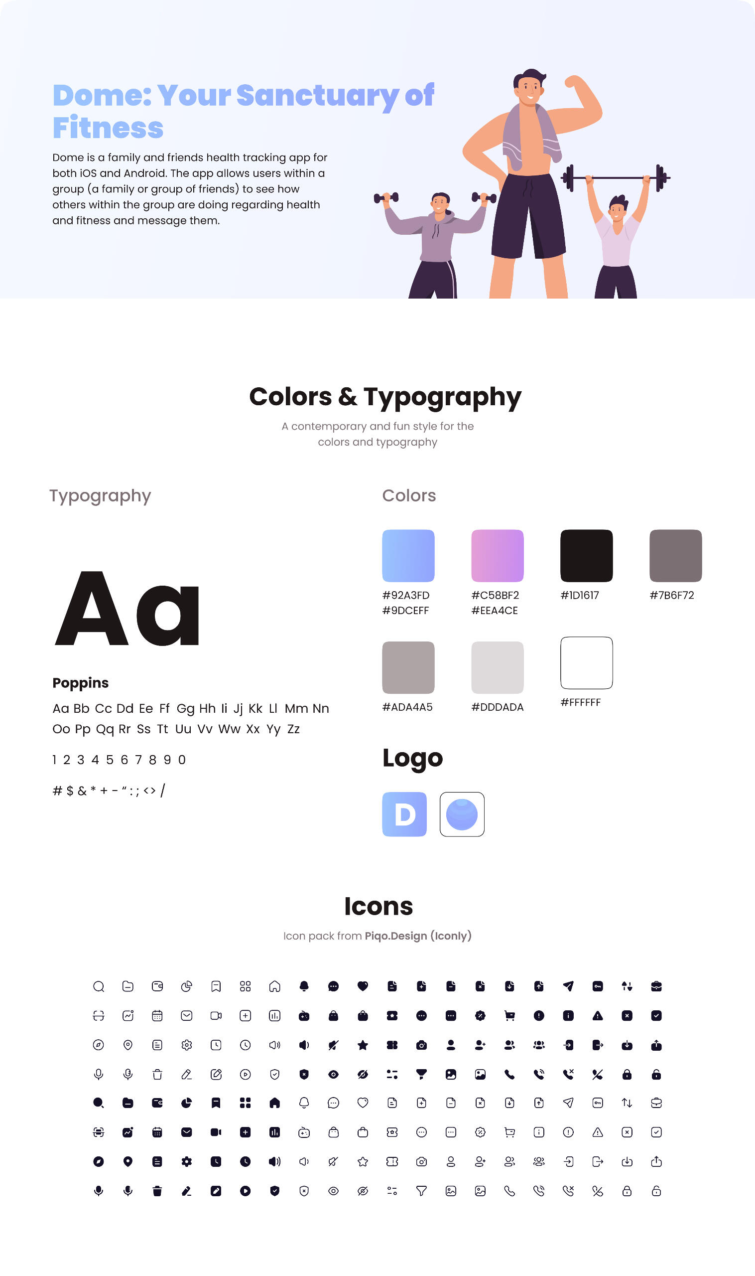
The Dome brand is contemporary, trustworthy and humorous. A pastel purple and pink reflects these brand values, and is easy on the eyes. "Dome" is also a name that suggests a safe sanctuary, which every user always needs for their personal health.
wireframes and prototypes
The wireframes looked like this. At this point, I am hoping to make a high fidelity version to test based on the wireframes.
first round of testing
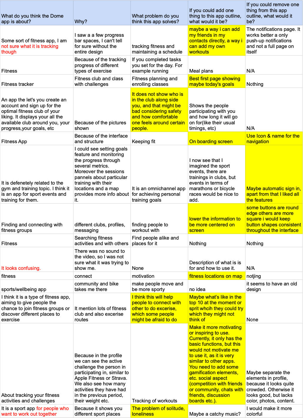
I tested the wireframes out with a few questions on a Google Form for the first round of user testing. Here's some of the results I got, out of which I highlighted the comments that needed to be incorporated. Most of the interviewees seemed to understand the main goal of the app, but the ones who still had some confusion are highlighted in red. Most of these responses also had comments on how the app could be made better.
High-fi prototype and second round of testing
My first high-fidelity prototype looked like this. This was the first version of the high-fidelity prototype that was user tested with specific tasks.
I tested this prototype with four users. I also asked my mentor at Springboard for critique. As seen in the video above, there were a few problems with the navigation, and the interviewees later needed to be guided to continue with their tasks. I asked them to complete the following tasks:1. Could you sign up for me and tell me what you felt while completing the process? What were you feeling while looking at the graphics?
2. Can you RSVP to the “Run Along With Waves” fitness club?
3. Can you go to your profile and check how many days you have left in your current challenge?
4. Can you tell me how many new messages you currently have?Here is the link to the Google Doc for the full testing script.Some of the important feedback I got are down below in the table. They are organized by color from high priority to low priority.
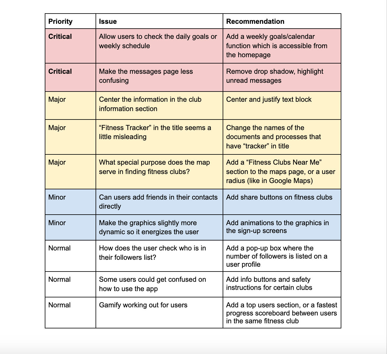
I made the critical priority changes highlighted in red in the new prototype below.
testing results and final high-fi prototype
This is a screen recording of the final prototype with all the changes. Here's a link to the full clickable prototype on Figma.
further features to explore
Some of the low priority usability issues that I want to work on in the future are:1. Add a character icon that follows the user everywhere to create more of a trustworthy feel. I was thinking about this after my first round of user testing, but I wasn't able to animate one while working on this project.2. Make the graphics present throughout the app more dynamic to energize the user. The graphics were taken from a UI kit that is stated in the brand identity, but I would have liked to animate the vector art also.3. Add info buttons to show where everything is for users who have never used this kind of fitness tracking app before. It was a low priority issue because everyone I tested with was able to navigate through the app, but adding info buttons helps with accessibility.4. Encourage users to workout more by gamifying the fitness tracking section of the app by adding a top users section, or a progress scoreboard between users who are in the same fitness club.
challenges and lessons learned
1. The most important challenge I faced was to narrow down the focus of the app into one thing. I have been told several times that it isn't possible to make an app that solves everything, and it was hard to pick out only one or two features from the problems that arose with my quantitative research. In the end, since the focus of the app from the prompt I was given was the fitness clubs and increasing user engagements, that is what I decided to focus on.2. Having people fill out my Google Form surveys was very cumbersome. Recruiting users for various tests and interviews took longer than anticipated. If there are monetary constrains, the only way to recruit for user interviews is through word of mouth and social media.3. Since this is an app that encourages users to be healthy, there is a lot of psychological research that goes behind the exact kind of motivation that is useful for a particular user. This app also incorporates social media elements (like followers, messaging other users, etc.) which is also decided on many other leading apps through psychological research. This is outside the scope of this project, but I would have loved to explore both these aspects further and determine what are the other call-to-actions and user task flows that can be incorporated to fit the goals of this app.
Meal Prep App
MY ROLE
UX Designer (Individual Project)
TOOLS USED
Figma, Canva, Penbook on iPad for sketches, YouTube, Google Docs, Google Forms, Google Sheets, Springboard Curriculum, Figma plug-ins for icons (Iconly) and for food cliparts.
Designing a Meal Prep app for springboard
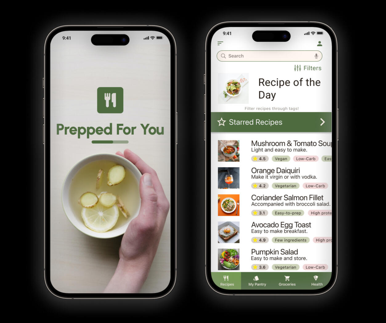
My time at Springboard is teaching me a lot of things. One of my favorite projects was my capstone 1 project. Through multiple steps, we had to sift through various ideas and work from ground-up to design and prototype an app that tackles a real user problem. I chose to redesign meal prep for the user demographic of adults who own a kitchen and want to cook their own meals in a world where meal prep can be confusing, time consuming and boring. I aimed to help the users realize that prepping for meals daily could be easy, quick and fun, and also tried to figure out if meal prep was actually time consuming or boring.
research and synthesis
Once I decided on a problem, the first step was to do secondary research which answered the following questions:
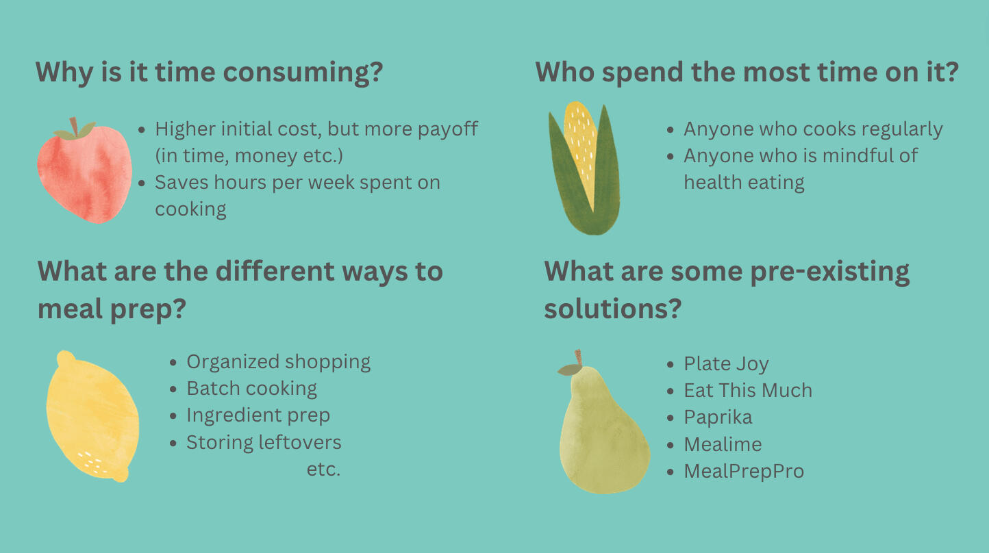
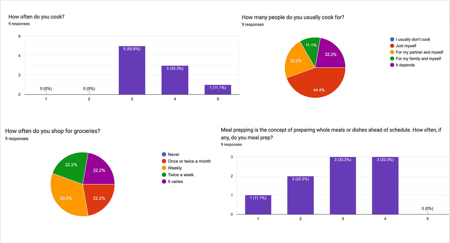
Then, it was time for quantitative and qualitative research. I conducted the quantitative research by sending out a Google Form that framed the secondary research questions in a more personal way. Here are some of the findings from the quantitative research for the following questions:
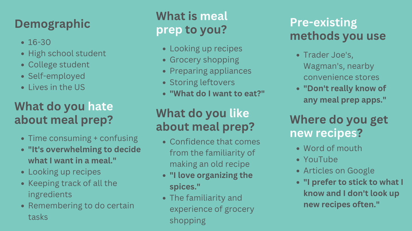
For the qualitative research, I conducted a batch of one-to-one interviews which helped me gain a deeper understanding of the user’s thought process behind meal prepping. I recruited these candidates through the form I sent out, and interviewed them for 30 minutes each. Some of my key findings were:
Once the quantitative and qualitative research was done, I started building an empathy map for the user demographic, and it looked like this:
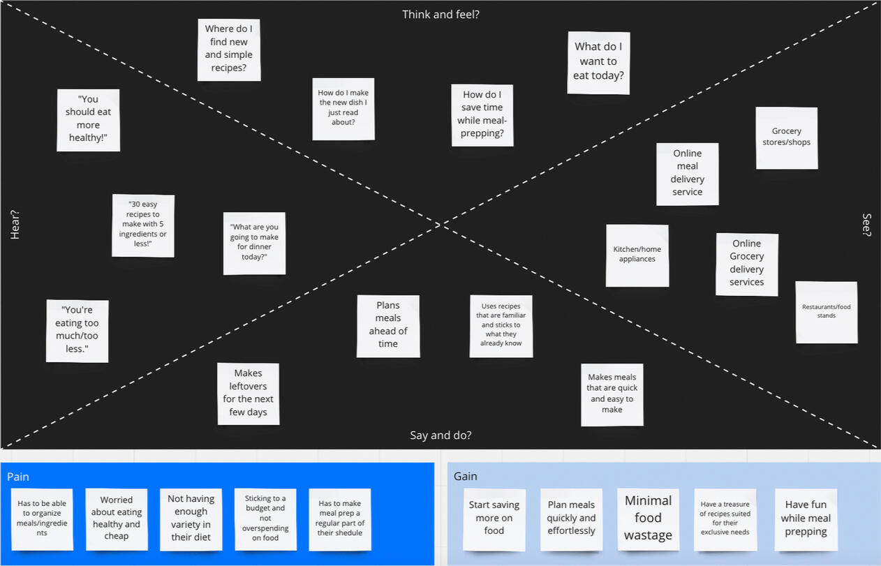
From the empathy map, I discerned the most important pain points of the user that needed to be addressed. I created two different user personas for this demographic that addressed the different pain points and it looked like this:
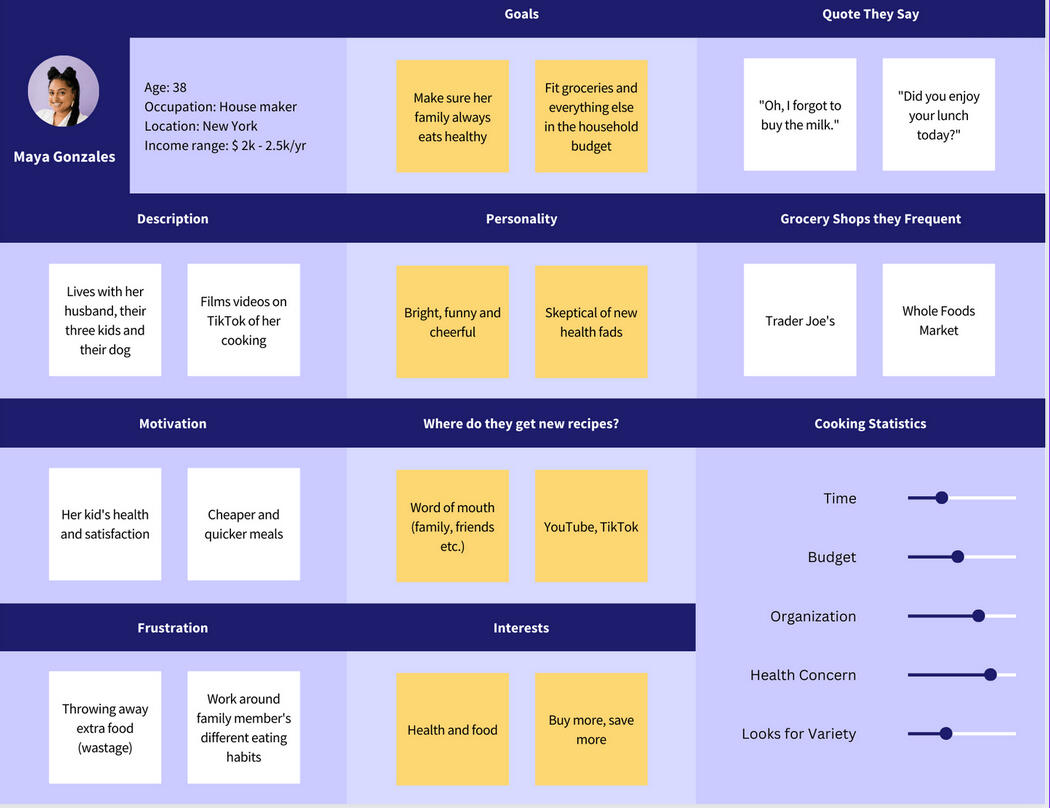
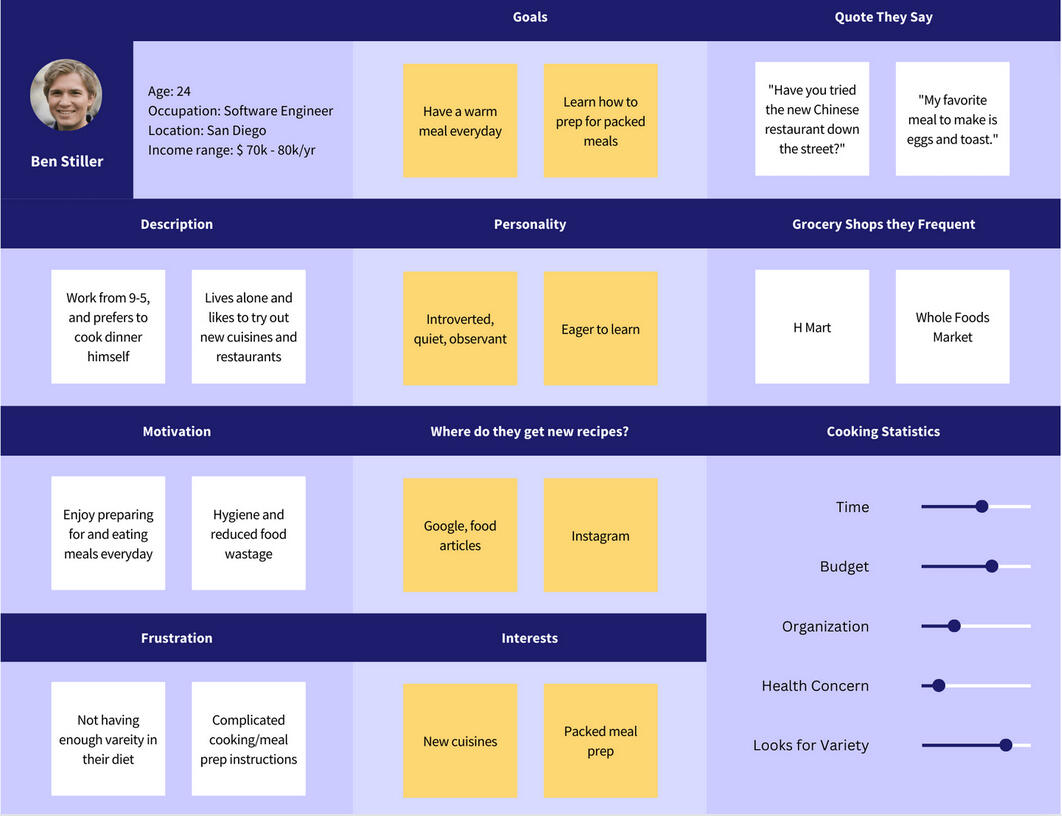
The main difference between the two personas was their motivations behind using an app like this, and what type of lifestyle could this app be most useful to.All my research findings were presented to a third party for review with these slides.
problem statement
" People who cook every day for themselves and their family have no way to organize the household's groceries, meals and eating habits. They worry about overspending on food, and struggle to make meal prep a regular part of their schedule because they don't know how to do it quickly and efficiently. "
sketching and guerrilla testing
I got some pointers on how to present a problem and the UX research, and that led to synthesizing this research and starting on the sketching. I sketched out some of the important red routes of the app, that included the sign in page, the home page, and the key design elements of the pages in the navigation bar, a few of which are shown below.
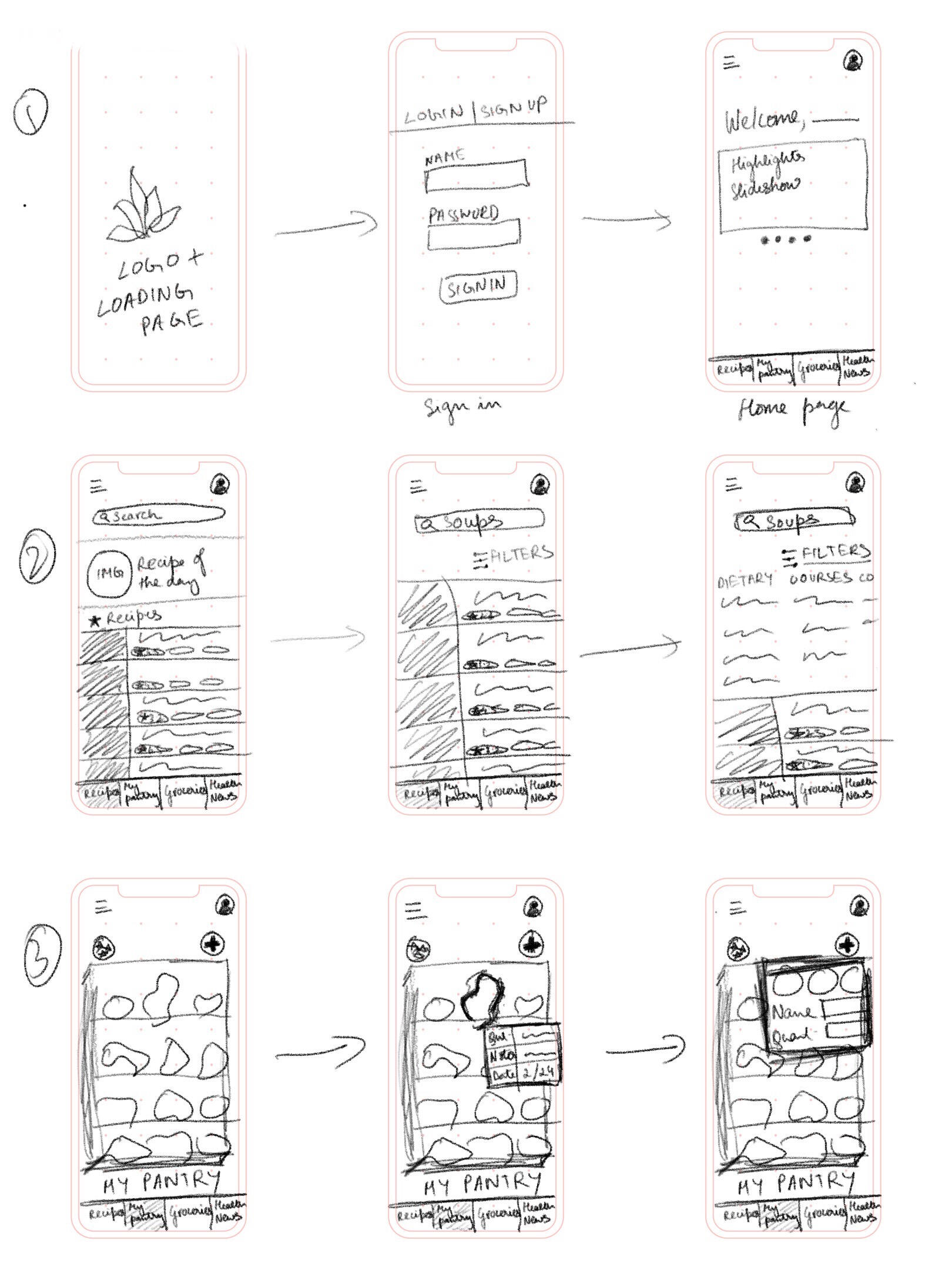

questions after guerrilla testing
I also conducted three guerrilla style design interviews with these sketches, where the user was asked to browse through these pages and figure out what it could be used for. Most of the results were that of a grocery style app that helps you organize your pantry and reduce wastage.At this point, I was wireframing these designs digitally with Figma so that I have a working prototype. Some of the questions I wanted to tackle further were:
1. Which characteristics are more valuable than others?
2. How would the solution compete with pre-existing solutions?
3. How can a new solution appear familiar to the users?
4. How can this solution replace the experience of grocery shopping and move it online?
wireframes and prototypes
The wireframes looked like this. At this point, I am hoping to make a high fidelity version to test based on the wireframes.
My first high-fidelity prototype looked like this. This was the first version of the prototype, but as seen below, it's not very usable during testing because it just switches between the screens by clicking.
testing and final prototype
I tested this prototype with three users. I also asked my mentor at Springboard for critique. I asked them to complete the following tasks:
1. Can you search for recipes for soup and filter them through ones that need 5 or less ingredients?
2. Can you go to the ingredients you already have and see how many walnuts you have?
3. Can you add 5 apples to your pantry?
4. Can you add 5 carrots to your cart and check your cart?Some of the important feedback I got were:
1. Why is the primary color red? Does it fit with the brand value?
2. There is no add button when adding a new pantry item.
3. The users preferred familiarity. I should have added labels to the search fields and pantry ingredients so they don't have to take too long figuring it out because they are unfamiliar with something.
4. The lists section of the homepage looks clunky and confusing. How can I make it more cohesive and aesthetically appealing?Those were the high priority usability issues. I made these changes in the new prototype below.
further features to explore
Some of the low priority usability issues that I want to work on in the future were:
1. To create a community in the app by allowing users to message each other. This encourages users to keep using the app by adding motivation.
2. To make the app more friendly and active by adding dynamic buttons and animations. I could not do this on Figma because user interactions while testing prototypes is limited.
3. To filter and use the pantry ingredients to make recipes. I added a button that gives the user a recipe based on the items in their pantry, but I need to flesh it out further.
challenges and lessons learned
1. The most important challenge I faced was to realize the limits of using Figma as a prototyping app. User interactions (like typing in the search field, adding dynamic aspects to the homepage that moves without being prompted by the user, etc.) were harder to incorporate in the prototype.2. Recruiting users for various tests and interviews took longer than anticipated. If there are monetary constrains, the only way to recruit for user interviews is through word of mouth.3. There are several similar applications that already exist. To make one that solves similar issues and to also keep it new and fresh is a challenge. I would love to explore call-to-actions that is new, and yet are easy to figure out by the users. (for example, sliding actions in the lists and pantry sections, dynamic success screens, character animations that fit user brands, etc.)
Lucky Parking
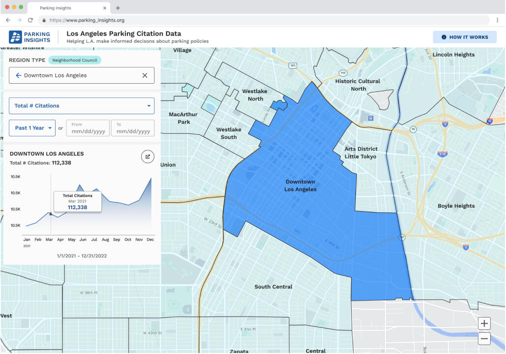
Since September of 2022, I have been part of a voluntary organization that harnesses technology and solves everyday user problems. Lucky Parking is one of the projects under the Hack for LA umbrella, and I was a part of the UI/UX design team. Lucky Parking is a data visualization tool that empowers citizens and neighborhood councils by giving them access to parking citation data. Our application maps 12 million+ open data points of parking citations on a webapp.My Roles: UX Designer, Product TesterTools used: Figma, Google Docs, Figma plug-ins.
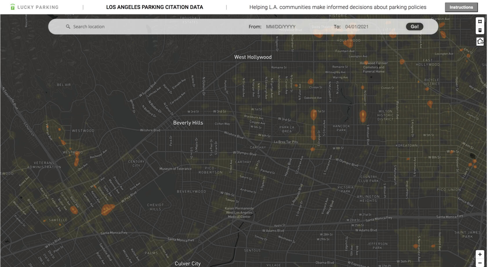
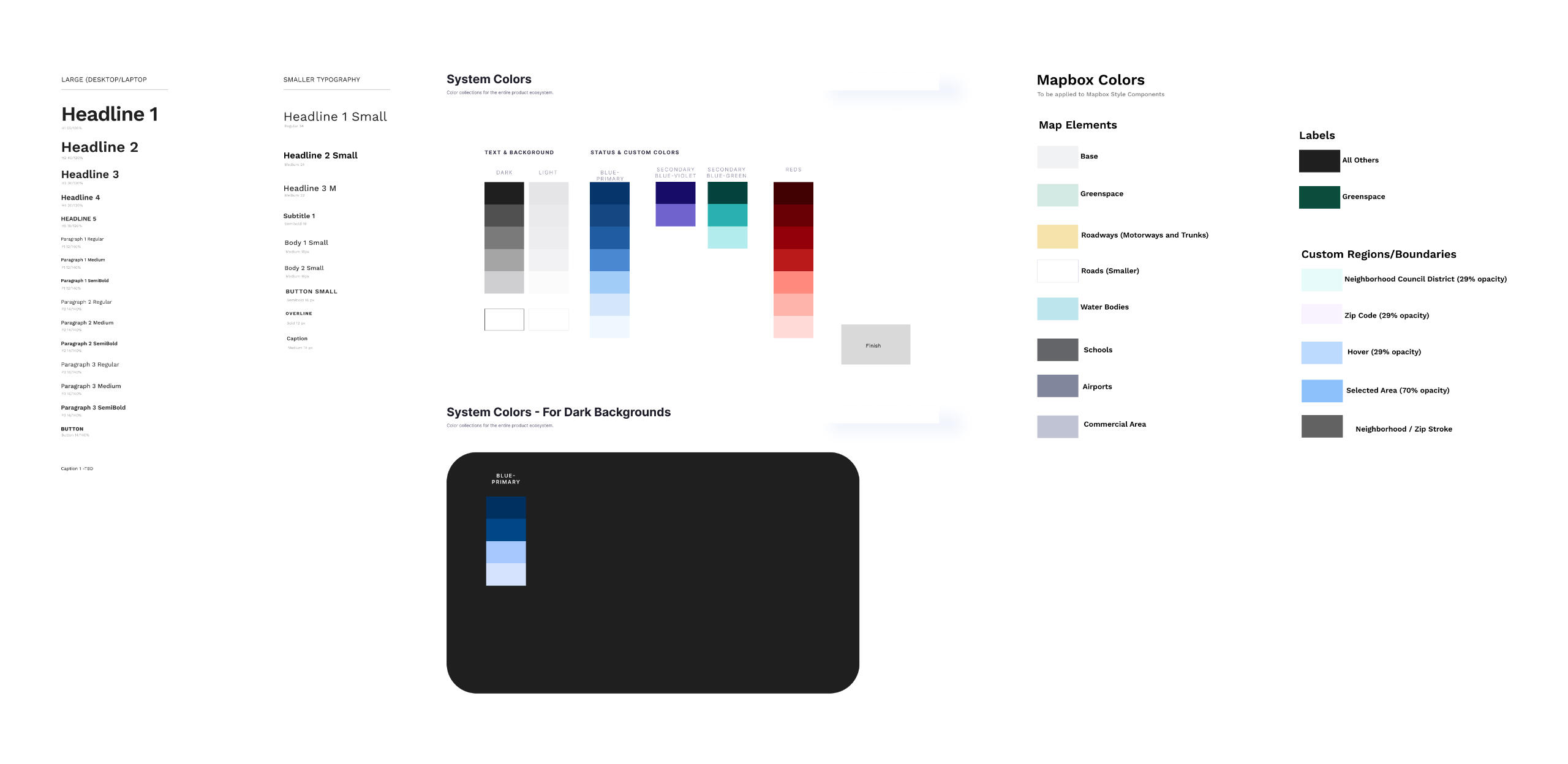
When I joined the project, it was already in its development stages. The user research and the low fidelity screens were done, and I had to start using the low-fi wireframes to create a high fidelity mock-up and their UI elements and groups on Figma.
This is a link to the low-fi version prototype on Figma.In the mid-fi version, we created the empathy map from some more user-testing, and brushed up a few of the functionalities including adding a user input option to the radius of the drawing mode on the map, changing the date picker so it's smoother, adding and testing ideas for the landing page, and making a few of the UI components.Now, it was time to make the high-fi mockups. We used Mapsicle, which is a free Figma plug-in, to add the map of LA to our mock-ups. We also set up a responsive grid in-case this project was taken to a hand-held device, and made a style guide that looked like this.
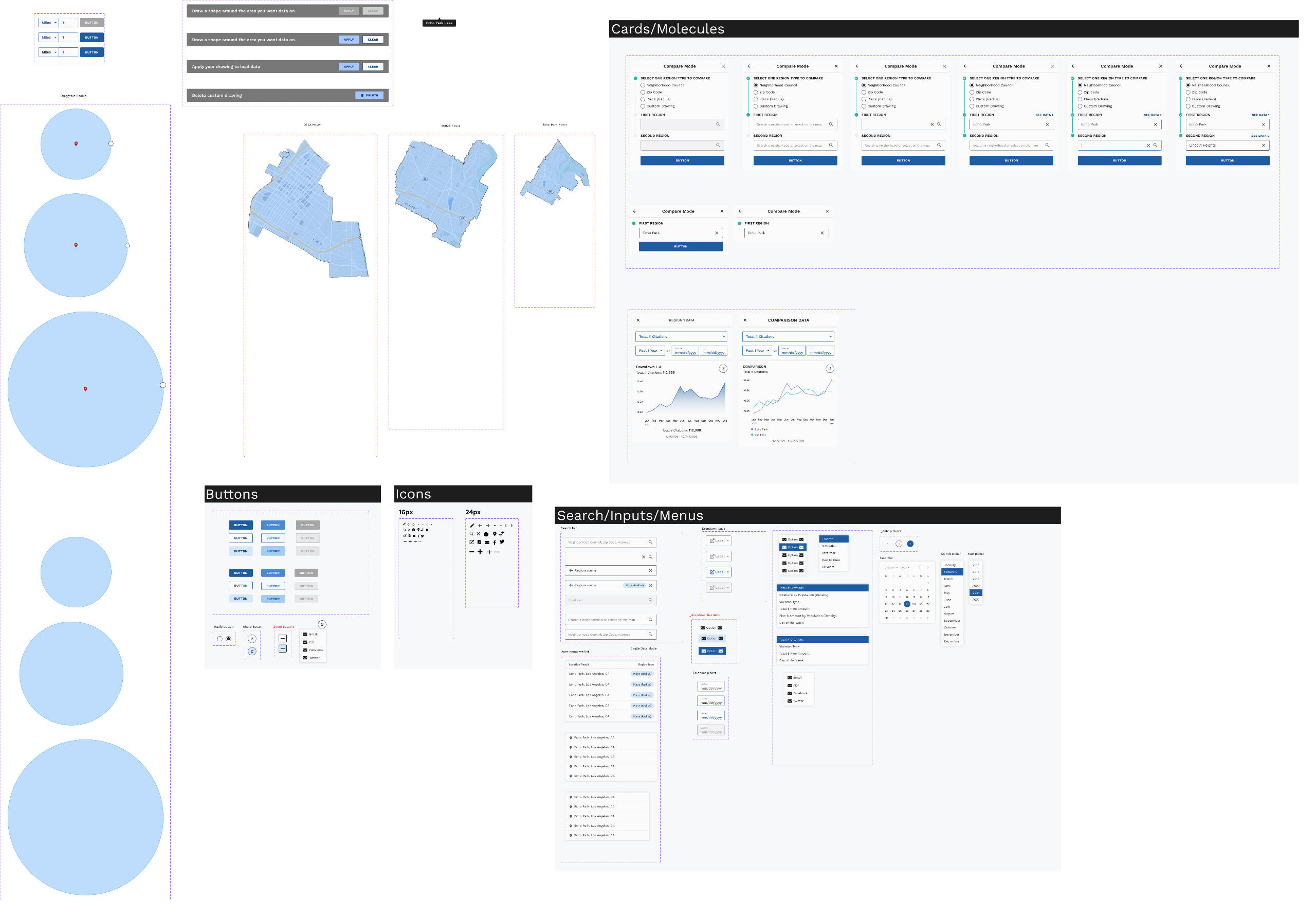
I made several of the UI elements by grouping the primary, hover state, and disabled instances of the buttons together and creating a component. I also decided which icons to use, the size and color of these icons for different screen sizes. After deciding on the color and layout of the different modes which the user can use to pull up the citation data for, we came up with the final high-fi components page.
When it was time to hand it off to the developers, I made the high-fi screen flows. We also made a finished prototype with each user functionality and handed it off to the developers.Currently, we are in the process of having meetings with the developers to finalize the finished product. Our next steps include getting the final website approved by our Hack for LA supervisor, seeing if we can include additional functionalities (like having the user be able to find parking spots), and deciding to see if we need to make a mobile app for it.Through this process, I learned a lot about creating a finished product up to the point of handing it off to developers. I learned a lot from my team and my team leader. We met up to three times every week to bounce ideas off each other, make decisions when we had opposing ideas, and split up the different tasks to do on our own time. I also learned a lot about how developers work and what they need to get a finished website to run. This was an extremely user-centric process, and my only let-down was that I wasn't a part of the project while it was still in its research phase.
Gallerypal: Design Sprint
The first time I ever did a design sprint was over the span of a day, and it was with a team of five people. It was also done over a single day, and stopped at the research phase. This sprint, however, was different in all the aspects. First of all, it was only me. Since it's modeled after the Google Venture Design Sprint, it was done over five days, and I ended up with a Minimal Viable Product (MVP). Let's see how it worked out!My Roles: UX Designer (Individual Project)Tools used: Figma, YouTube, Google Docs, Penbook on iPad for sketches, Springboard Curriculum.
Day 1 — Map
Using bitesizeux.com, I picked a prompt. The project was called GalleryPal, and they were trying to increase customer satisfaction by improving the experience of viewing paintings, sculptures, installations etc. in museums and galleries. I listened to three user interviews of frequent museum-goers and highlighted the points that could be worked into the product. I also highlighted the problems that came up in an expert interview. To sum the research findings up in a problem statement:PROBLEM STATEMENT:
" The problem we are trying to solve is how to improve the user experience of people viewing art in a museum or a gallery and to improve customer satisfaction. What most of the users want is missing background information about the exhibits in the gallery, more information about the artists and how they came to make the exhibit (their technique and their technical process), a brief overview of the different exhibitions, and maybe even have the artists themselves talking about the details. "Next, I drew up a simple user map for the primary function of the app.

Day 2 — sketch
On the day of sketching, I sketched out eight versions of the most important step of the user map in a Crazy 8s challenge.
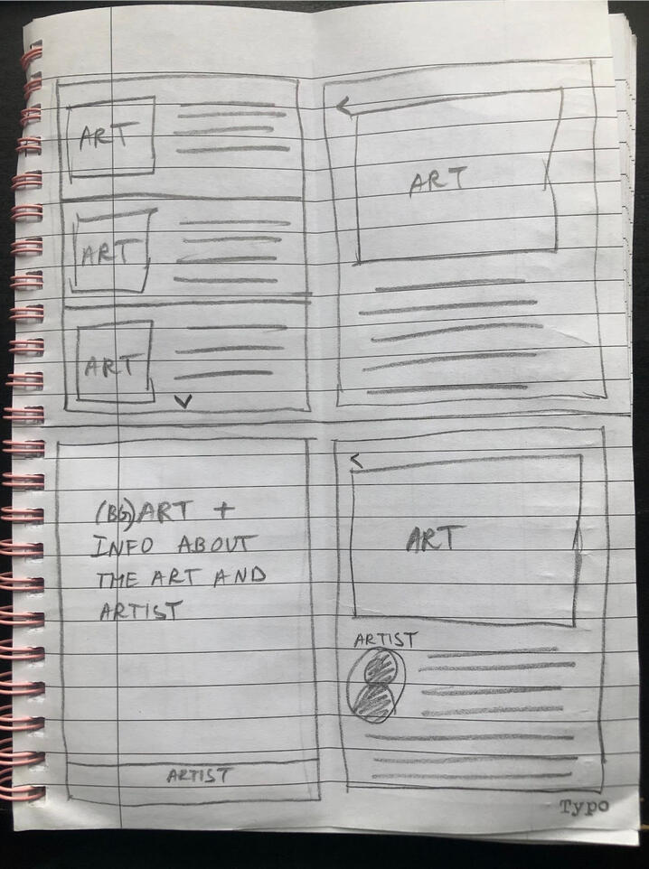
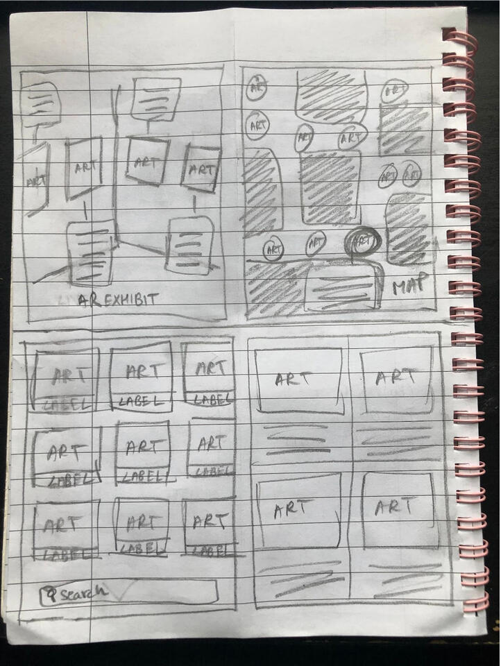
Picking one version was not easy, but I used a process of elimination to pick the best one. I filtered out the versions based on usability and aesthetic. I also referred to similar apps like Cuseum, Rijkmuseum, Explorer - AMNH NYC and Google Maps. After picking one, I sketched out the rest of the screens based on the user map.
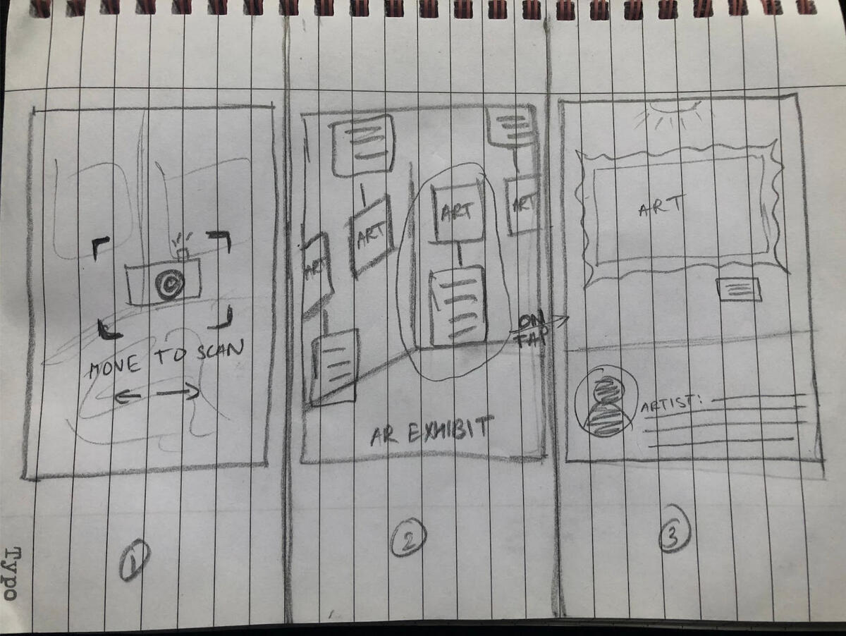
Day 3 — decide
For Day 3, I sketched out a simple 8-panel storyboard that acted as a wireflow for the app.
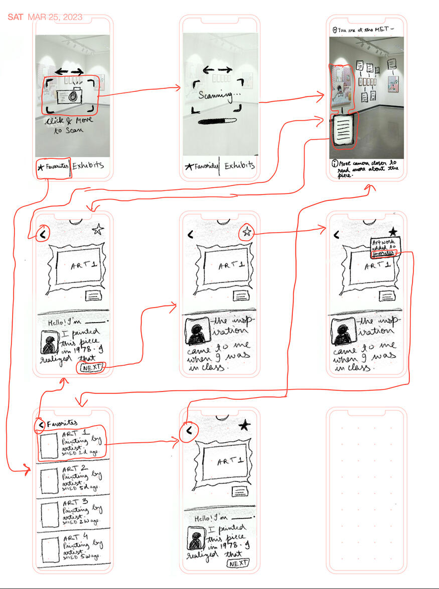
This sketch addressed the user pains in the problem statement.
1. It gives the user background information on the artwork when they click on it.
2. It is interactive and fun to use with AR technology.
3. It gives more information about the artist, the time they lived in, how they came about their artwork, and their technical process below each artwork.
4. The artist themselves talk about the painting in first person, like a dialogue box accompanied by an image of the artist.
Day 4 — Prototype
I converted these sketches to a clickable prototype on Figma.
As the user moves closer to the artwork, the tag on them gets bigger and more readable. This version was going to be tested with a small group of people for feedback.
Day 5 — Test
The user issues after testing with three users were:
1. What if the camera is not working/blocked? How do the users find the artwork? Most of the users had to be told how the AR function works because I couldn't replicate it in Figma.
2. How can the users share artwork and exhibits with other people? One of the participants wanted to send links to their friends.
3. How long would it take to incorporate this scan function to every exhibition? Will there be a waiting period to get this function on every museum/gallery? This was more of an afterthought, but it seemed like an important question bought up during the interview.I hope to fix these problems and create an improved prototype in the future, and conduct more rounds of usability testing to smooth out the functionality of the app.
challenges and lessons learned
1. Since I am using AR as a primary functionality of this app, I know this might not be a very practical solution because it would require the integration of each of the galleries and their permission to map out each of their exhibits.
2. Working alone helped me set up a system of both working and processing, from start to finish. This also helped me get the closest experience I could get of what it would be like to have a real-world project under a company.
3. For a design sprint, this problem had a large scope, but it helped me understand the importance of sketching and MVPs. It also introduced me to several design sprint terms and exercises I hadn't heard of before, like Crazy 8s, online expert interviews, storyboards, etc.
Riota: Clothes Renting App
Coming back from the pandemic, all of our lives were starting to go back to normal, and while talking to my friends, I realized that there were still many problems we were facing, both personally and economy wise. With the declining urge to go to a shop and physically shop for clothes, a lot of the process had become digital, and people did not want to spend as much as they did to buy new clothes. Buyers in a lower economic status did not want to spend a lot on clothes they were probably only going to wear once, and people who had too many clothes already had nothing to use it in. Therefore, I thought of designing and user testing an app and a brand called Riota which would serve as a platform for browsing and renting through clothes.Some of my main objectives for user testing was to see if it was easy to use and understand, to make the user aware of why they should rent clothes rather than buy them, and for the user to understand the main purpose of the app. The target users were (a) buyers of all ages looking for cheap designer clothes, and (b) sellers of all ages who want to invest in their rarely-used clothes.I user tested five people of different social and economic backgrounds with different relationships with shopping online. I asked them a few basic questions before live-testing them, and asked them to record their screens as they navigated through the prototype and completed some of the per-requested tasks. I ended the user test with a few more questions like, what did they like about the experience, and if they still had any apprehensions about renting clothes, or if they would be ready to rent from it.Some of the improvements I incorporated in the final prototype were:
1. Include more advertisements in the home page to have a more dynamic feel.
2. Changing parameters in the filter button, included a drop-down menu for each parameter for convenience and accessibility.from:
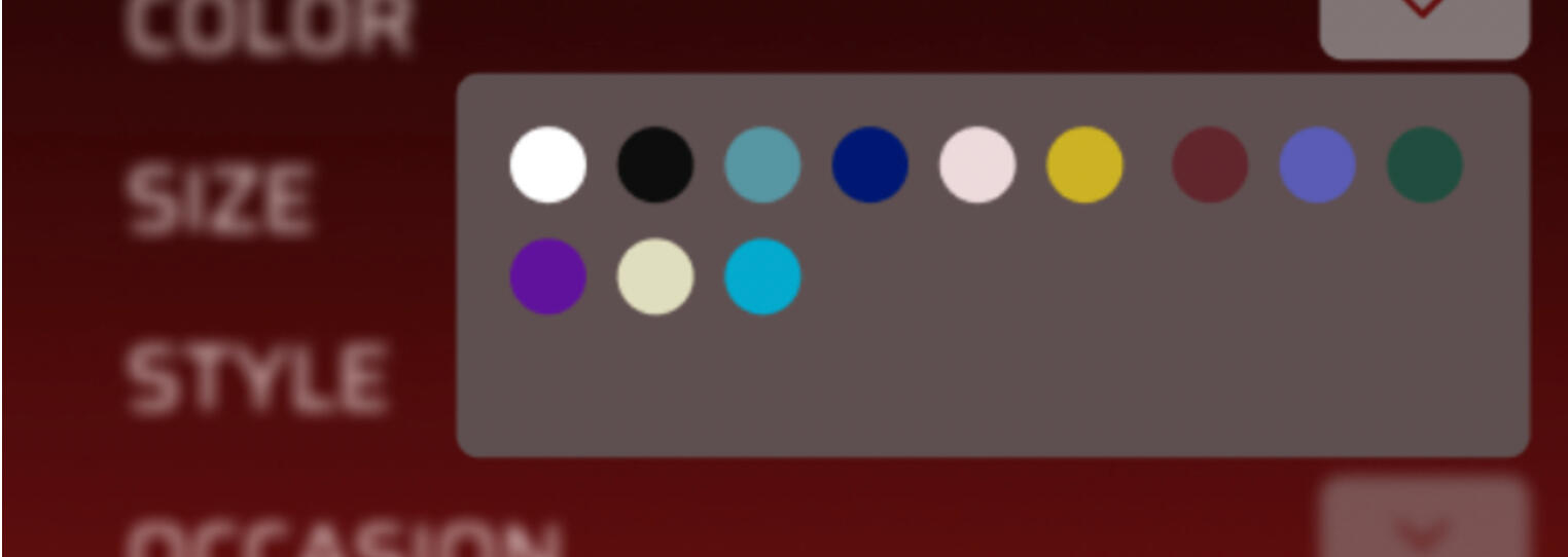
to:
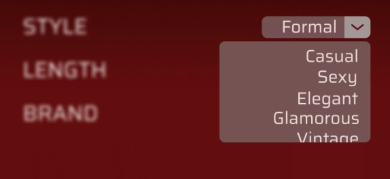
3. For the users who didn’t know the difference between the different filter categories, more about different styles on a new discover page.
4. After a class discussion, I decided to change the brand objectives into something that shows modern and minimalist qualities, along with affordability and sustainability.from:

to:
This is the link to the final prototype on Figma, and the link to the style guide for the app and the brand. The functionalities are limited because of the limited time I had to complete it, but the responsive areas are marked in the prototype.Finally, some of the future plans for the app that I want to include later on are:1. To expand the testing to several more users so that I can form polls on more changes.
2. To design a stamp of sanitation that will be included with the clothes in the delivery.
3. To add a discovery page that will give information about sustainability, sanitation, different brands, styling and price ranges.
4. To design a sellers page after finding and interviewing users who want to invest in their clothes. (NOTE: This was supposed to be one of the original functionalities of the app, but I could not find any testers who wanted to rent out their clothes, so I removed the option from the final design)
5. To design a high-fidelity prototype of the web app with more accessibility features.
6. To include more drop-down menus for the filter categories so testers can browse through more options.
7. Use a clothes API to add more browsing options and be able to filter through the clothes with the filter button while user-testing.
8. Find out and analyze more methods to put a user’s mind at ease about renting clothes by adding it on the information page.I hope to incorporate these changes when I find more user testers and a more concrete plan for user testing.
Interactive Archival Website
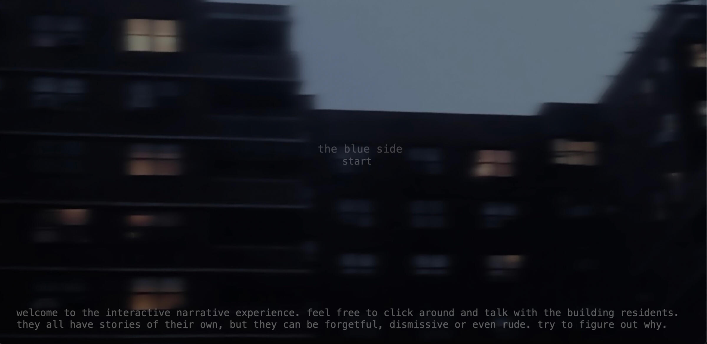
Link to website: http://142.93.248.217/This project is called The Blue Side and it is a website based on characters and their interactivity with the users. It includes themes of evolving technology, untold stories and the rising dependency that people have on technology. I designed a live interface of a building with several tenants that the user can interact with using chat bots with premeditated responses. The elevator pitch is, “A project that shows the importance of preserving and retelling stories with artificial intelligence, creating a general archive for future reference.”On the technical side, I designed and hosted the website with HTML, CSS and JavaScript. It lives as a design website hosted on a public server on Digital Ocean. Each character prompts the user to have a conversation with them so that they can relay their individual stories. Once the user exits the building, they can read and add their own anonymous story to the story board. Therefore, this website acts as an archive of stories that might be lost some day. I wanted to make this project to highlight the importance of storytelling and how important it is to preserve the stories that are passed down the family tree and across the tree to acquaintances. The target audience is anyone and everyone that is ready to read and write about unique experiences and characters.
Real Time Media Live Performance
With the prompt of taking a fairy-tale and broadcasting the story for a live performance showcase using live object theater, my three teammates and I decided to perform the old Grimm’s story of The Robber Bridegroom. We drew up a script and decided to broadcast a mix of pre-recorded videos made with Unity on a green screen with puppets in front of it for the main characters. For the dialogues, we used our pre-recorded voices for the different characters. I was in charge of sound design and video mixing for the performance. We used Max to control and connect the different aspects of the performance. For example, we used Max to turn the green screen into a chroma-key so it would be easy to broadcast the video behind the puppet characters. Above is a link to the live video performance for the showcase.
Video Project: Narrative Short Film
This short narrative film was shot on a Canon EOS 650D. My plan for the project was explore a new genre and to make a VHS style home video in a found footage style featuring the main character moving into a new house and facing some new challenges. I used the VHS and film edit filters to bring out the idea that it was recorded on a camcorder from the late 90’s.For the 90’s look, I wanted to bleach out the videos by increasing the brightness and de-saturating the film. Then I wanted to add some grain and blur, and finally add the VHS filter from the Prequel app. For the storyline, the film shows a girl moving into a new apartment in rainy weather, and realizing that maybe she isn’t as alone as she thought she was. I have never experimented with the horror genre, and therefore, I tried to incorporate many of the elements that is needed to instigate the fear through the screen, including slowly building music, eerie silence, loud and abrupt sounds and low and dramatic lighting. For the shots and movement, I wanted to incorporate a few different techniques:1. Selfie shots
2. A steady focus on the moving object
3. Recorded phone conversations out of camera to further plot line
4. No music, only ambient sounds, maybe imported rain and thunder noises
5. Props and costume to fit into the time periodThis video helped me explore the unfamiliar genre a little, and I like the fact that it doesn’t have a rigid story line, because I want the viewers to have their own interpretation of what happened in the end.
Video Project: Relating Sound and Motion
This mini video project was shot on my Canon EOS 650D, and it was an attempt at relating sound and vision. This project is called ‘Solitude,’ and it’s a short film on what being with yourself usually looks like. It doesn’t have to be sad or lonely, it can just be a time you use to reinvigorate and stay away from bad thoughts. I think it is important to prioritize what we do with solitude with the time we have inside these days. I hope the warm colors, the mostly non-dynamic protagonist and the ambient music encourages the viewer in taking some time off for themselves too. Spending time with yourself can be the happiest moments of your life. I used warm, steady images with ambient noises and a slow background music (that is not too intrusive to the images shown) playing quietly in the background, almost like you’re listening to your neighbor’s music.One important thing I learnt while editing this video was how important color of the film was to set a certain mood, and how the color palette can be warm or cool. In ‘Ma Rainey’s Black Bottom,’ George Wolfe colors the entire film a warm yellow, which is almost sepia. It is a period film and there isn’t much variation in setting, but the color of the film shows the heat of the day, which is an important representation of ‘frustration’ in the plot. Most romantic comedies use warm colors to show the light-hearted nature of the story, and I wanted to use it to show the peace that comes with solitude too. In Chaitanya Tamhane’s movie ‘Court,’ he doesn’t move the camera once between shots. It acts as a omnipresent third-person voyeuristic view on the proceedings of the case that is showed in the movie, and we can see that even with the horrible consequences of the case, life still goes on as normal. This method of filming was also a really big inspiration for me, so I want to incorporate it into my project as well.
Art Corner Website with HTML
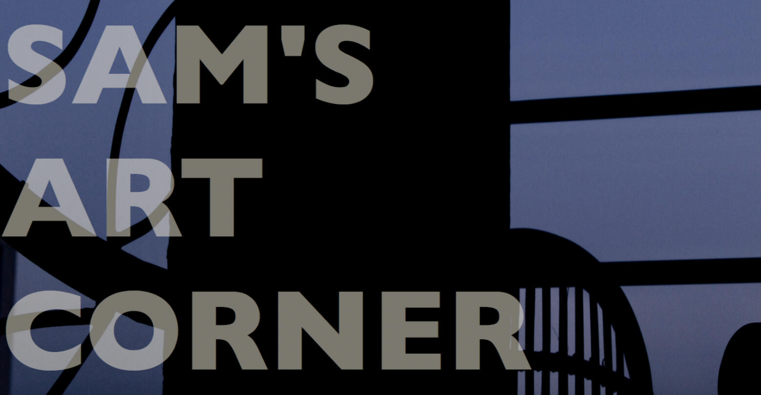
Link to website: https://sam-sengupta.github.io/midtermproject/midtermproject.htmlThis is a website I made from scratch with HTML and CSS which serves as a portfolio for my photography and my movie, book and song recommendations. The code is on Github and the link to the website is above.
Twitter Bot with Javascript and Heroku
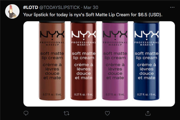
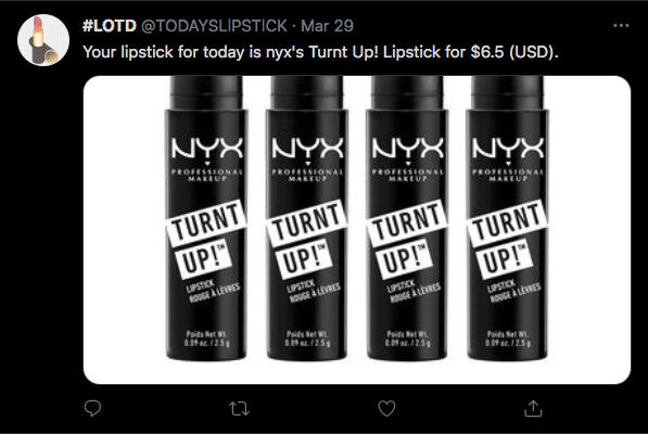
Link to Twitter page for the bot: https://twitter.com/TODAYSLlPSTlCKFor this project, I made a Twitter bot that tweets a picture of a different lipstick everyday from an API, and deployed it using Heroku. The code is on Github, and the pictures are some of the example posts.
Live Coding with Hydra
This is a video from my teammates and me live coding a ‘retro arcade game’ theme with audio (Kaitlyn and Connie, my teammates) and visuals (me) on a live that was streamed for our class finals. I used Hydra to code the visuals that are in the background. The video below is a link to a live stream, starting from the time my team performs.
This is a re-upload of the recording of my live performance where I live code a visualizer to one of my favorite songs using Hydra.
Video Editing
This is a video edit I made with Filmora 9 to show the world as I imagine it to be in the future. It’s dystopian world where people are all hooked up to a completely immersive AR machine 24/7, where they live lives in grand fantasies with endless possibilities. This video is supposed to be your point of view when you get an advertisement for the new system update for your machine world. Most of the clips are from sample game advertisements from YouTube, and the audio is from YouTube too.
boo


